THIS HOWERTON KITCHEN REMODEL WILL TAKE YOUR BREATH AWAY
HOWERTON KITCHEN REMODEL – BEFORE AND AFTER
In our Howerton kitchen remodel, our customer wanted the small corner space to be opened up and redesigned in a way that fit the colonial, modern farmhouse style of their abode
Having kids is one of the common reasons for wanting to remodel a room in the home. Our client for this project is a family of five that includes two tots and a baby. They needed the tiny and dim kitchen to feel larger and brighter. At the same time, Mom and Dad wanted it to fit the style of the rest of the house. With this design inspiration, we went to work on upgrades, constantly adding hints of the traditional old-world charm to this kitchen remodel.
Before remodeling
Howerton Kitchen Remodel
The kitchen is the busiest and the focal point in a home. Therefore, it should be the most functional as well. But nowhere is it written that efficient cannot be stunning at the same time. We thought this Howerton kitchen already had two things going for it – a popping backsplash and warm floors. What we noticed missing were texture, anchors, and soft, clean finishes to transform it from purposeful to spectacular.
TRANSFORMING THE HOME KITCHEN FROM WELL-ORGANIZED TO CHILD-FRIENDLY
Before the remodel, this Howerton kitchen was compact and structured, a layout perfect for a family of adults who love to cook. There was enough countertop space for food prep, and an abundance of cupboards for storage and orderliness. Even the appliances were obviously chosen by people who knew their way around the kitchen.
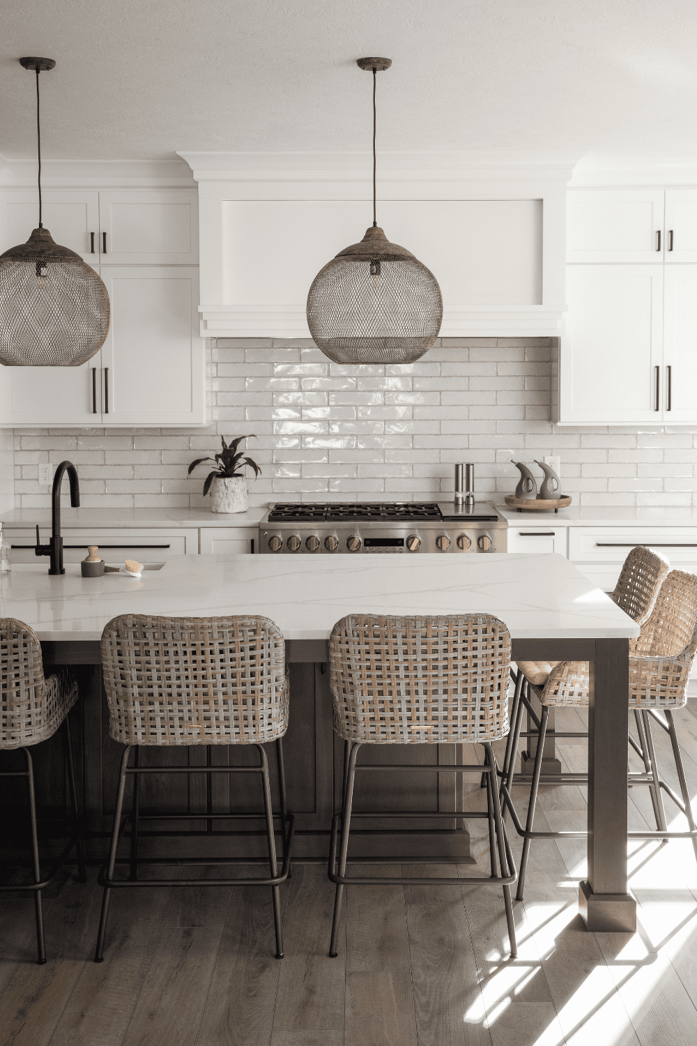
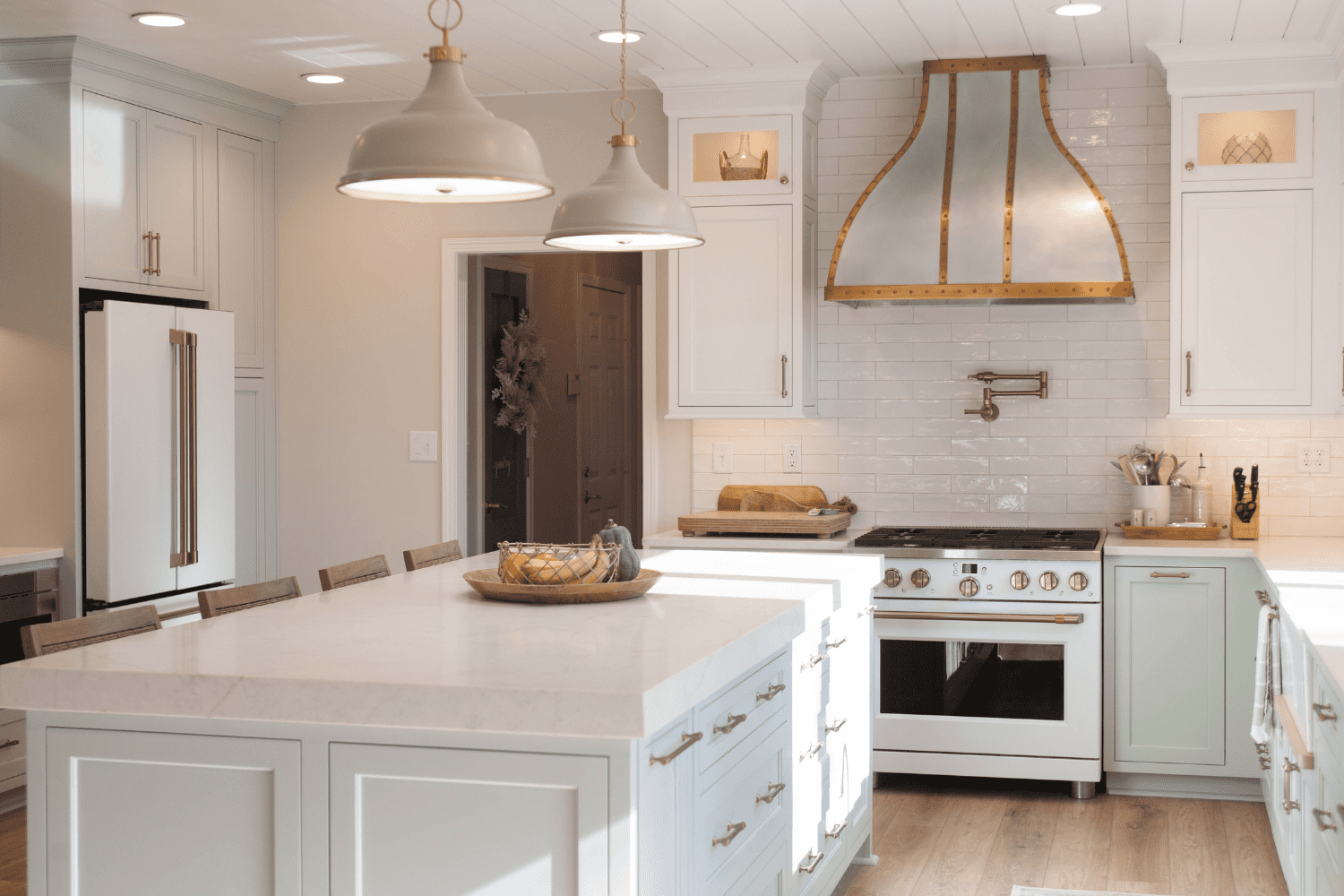
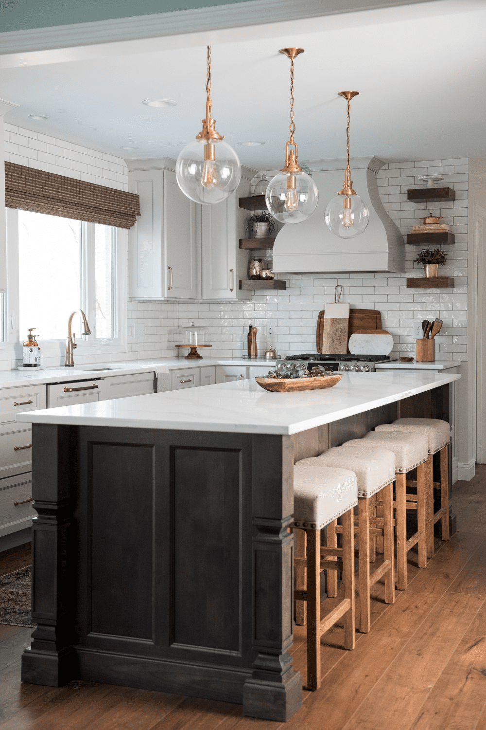
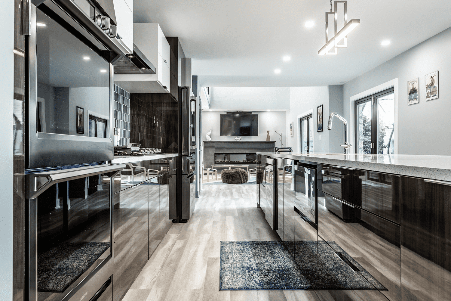
In order to set the tone for family bonding, we removed the wall that separated the space from the living room and installed a large island in its stead. We hung a charming chandelier over it, and another one atop the dining table, to keep both spots bright at night. Dark stained countertops made way for white ones, and we opted for a Caviar-stained white top for the island as well. All of the appliances were placed on one side for easier control of adventurous little hands.
LIGHT GRAYS, STARK WHITES AND WARM BROWNS BRING TOGETHER A COLONIAL AIR AND MODERN FEEL IN THIS KITCHEN
We refinished the existing hardwoods with a Walnut stain to bring out the homey atmosphere that every traditional kitchen should have. It also grounded the white cupboards, subway tiles and kitchen sink. For the cabinetry, we opted for Repose Gray to break the monotony of white while keeping the cheery ambience.
We love how the oversized island created a practical focal point of convergence not only for the couple and their kids but also for visiting friends and relatives
Replacing walls and dividers with kitchen islands is a technique that has been gaining attention lately, and for good reason. It’s an ingenious way of opening up spaces adjacent to the hearth, whether it be the dining area or the living room, or even both.
Blocked illumination is eliminated, ventilation is improved, and traffic flow is made more efficient. All these give the illusion of a bigger place while territories are maintained. We raised the notch by making the island both inviting and serviceable with brown stands and chairs on one side, and storage cabinets on the other. Our clients, the kids included were pleased with the look and had their dining table custom built and stained to match the island.
We used mixed metals and the warmth of the dark brown floors and island to balance out the bright walls, cupboards and ceiling. Satin Bronze hardware and kitchen faucet lent a dash of elegance and flair. Larger Bronze light fixtures helped anchor the Caviar-topped island and Walnut stained floors. Stainless steel appliances complemented the Repose Gray cabinetry and reinforced their seamless appearance. The transformation upgraded the function of the home as suitable for a young family.
Opening the kitchen provided a better flow, and they can now enjoy spending time together even in the kitchen. And with the combination of metals and wood, we maintained the modern-colonial overall look of the home.
MATERIALS USED IN THIS HOWERTON KITCHEN REMODEL
- Colors: Perimeter Cabinetry and Shiplap around the double-sided fireplace in Sherwin Williams Repose Gray; Island in Alder Caviar stain
- Shiloh Inset: Square flat panel door style with 5-piece drawer fronts
- Countertops: MSI Q Quartz Calacatta Venice
- Tiles: Boutique 3×8 handcrafted subway tile in white
- Cabinet Hardware: Jeffrey Alexander Belcastel 1 in Satin Bronze finish
- Kitchen Faucet: Delta Cassidy in Champagne Bronze finish
- Kitchen Sink: Blanco Diamond single bowl in white finish
- Lighting: Millennium Lighting 4 Light 16” Wide Taper Candle Pendant in Rubbed Bronze
- Chandelier: Lillian Gray Wood Bronze Wagon Wheel 27”
- Existing Hardwoods: Refinished with a Walnut stain
REMODEL THE HEART OF YOUR HOME AND MAKE IT A PLACE WHERE FAMILY AND FRIENDS UNITE
EXCITING LITTLE DETAILS
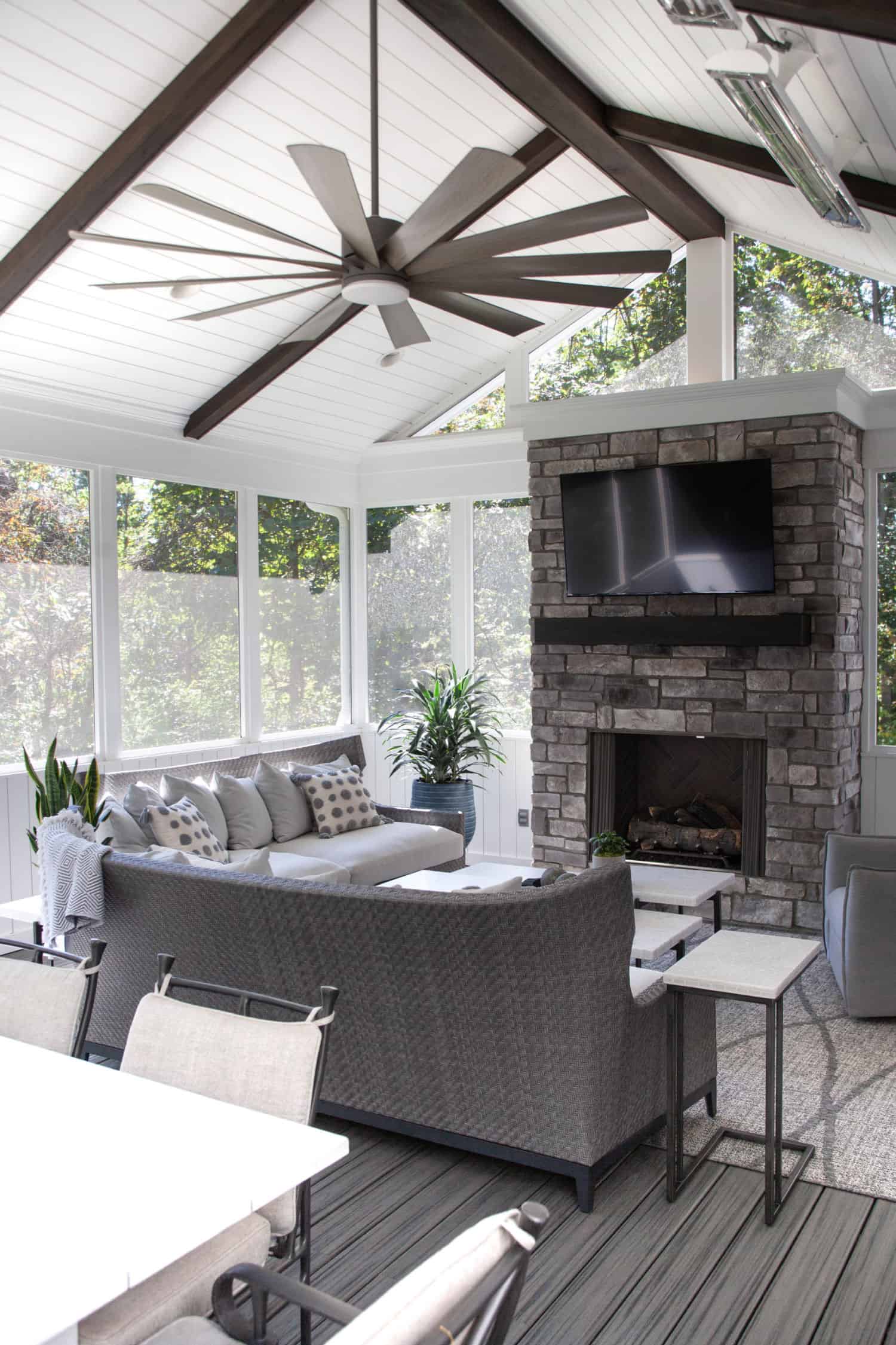
The double-sided fireplace was a treasure we could not resist using as the endpoint to keep the entire first floor cohesive. Adding tall pantry cabinets at the end of the fireplace alcove tied it all together with the seamless flow of the kitchen. We also installed vertical shiplap on it to make it seem as though it had always been there. These striking touches completed the overall design.
THE FOLLOWING ARE OUR Kitchen REMODELING SERVICE AREAS
McCordsville, Indiana
Fishers, Indiana
Carmel, Indiana
Lawrence, Indiana
Greenfield, Indiana
Zionsville, Indiana
Noblesville, Indiana
Whitestown, Indiana
Westfield, Indiana
Rocky Ripple, Indy, Indiana Meridian Kessler, Indy, Indiana
Castleton, Indy, Indiana
Meridian Hills, Indy, Indiana
Fortville, Indiana
Pendleton, Indiana
