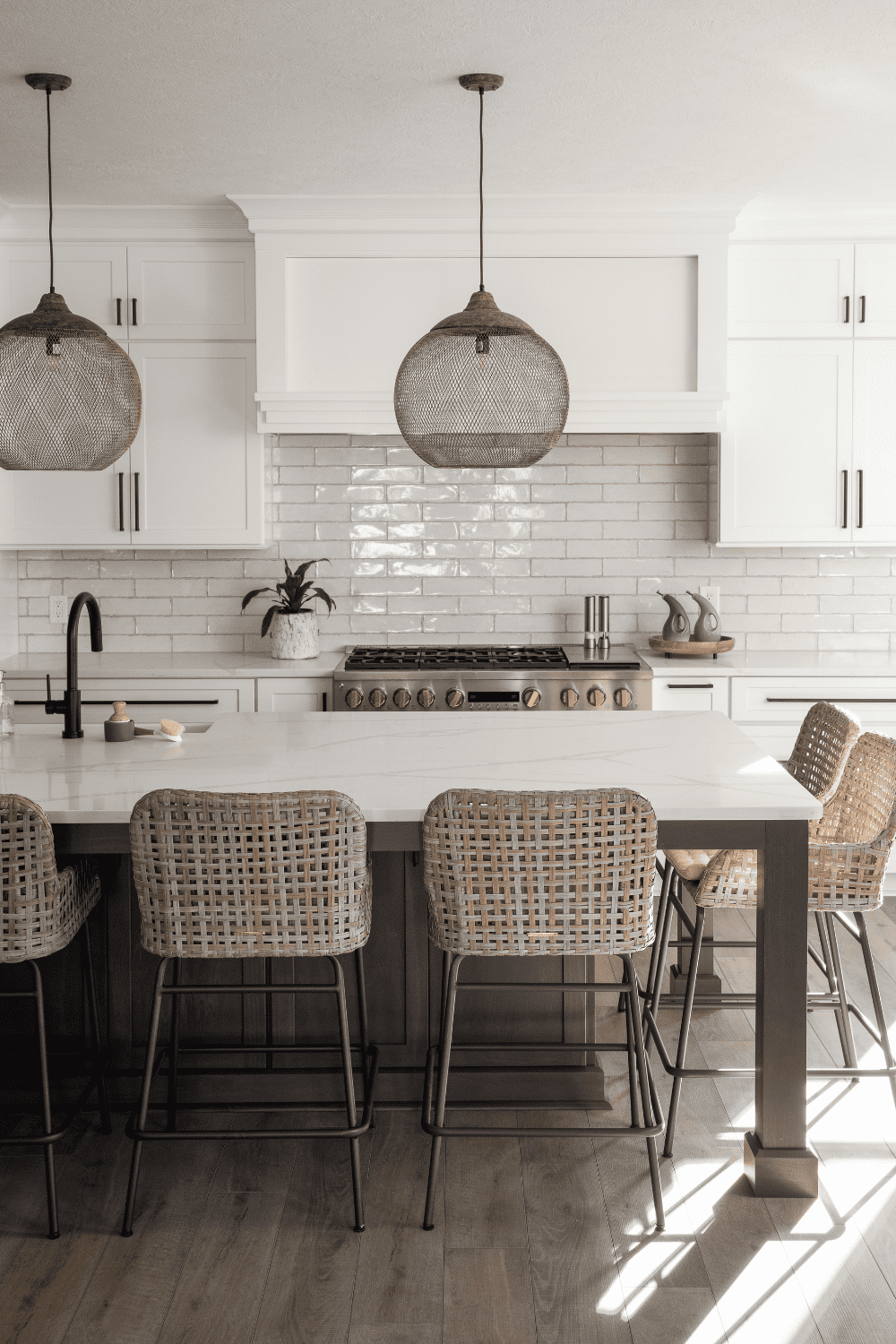
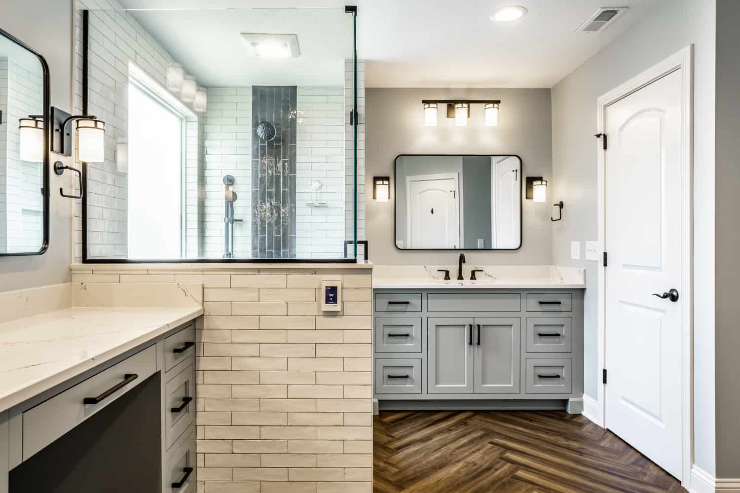
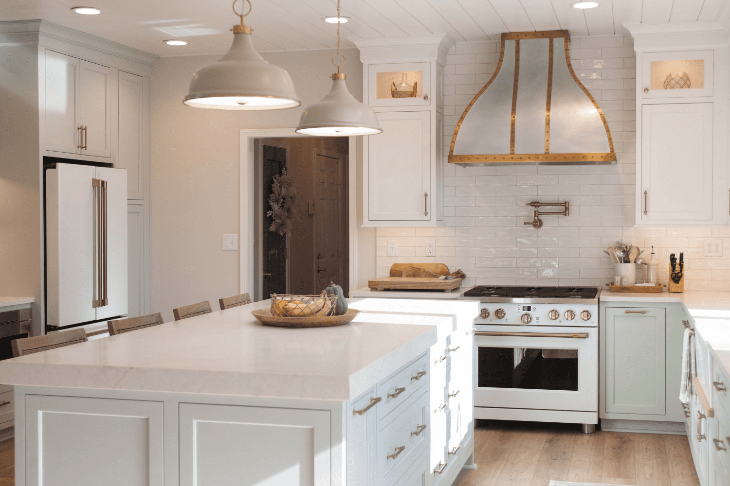
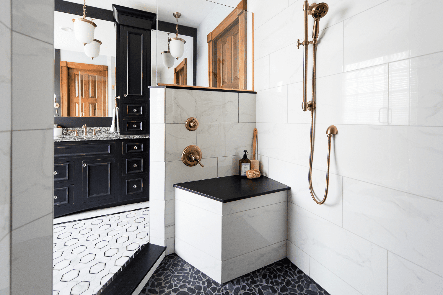
This cicero kitchen remodel will leave you astounded
Cicero kitchen- Before & After
In our Cicero kitchen remodel our customer wanted a brighter space appropriate for a Morse Reservoir location. It isn’t often that we get to work with a family who knows exactly what they want. For this project, our customers gave us clear instructions: Open up the kitchen and make the whole first floor of their home lighter and airier. Our goal was to draw from a deep well of carpentry skills and artistic expertise to transform their vision into reality.
Before remodeling
With so much unused space waiting to be tapped, integration and decluttering were in order.
This dim and cramped Cicero kitchen is about to become a spacious modern haven for delightful casual dining.
Adding more breathing space and elbow room to a crowded home kitchen
Inspired by the cool breeze that wafted from the lake, our plan was to create a clean, contemporary feel in the kitchen.
Our first task was to identify obstacles that restricted movement, items that inhibited the entry of natural lighting, and space wasters. By integrating the seating into a larger island, we were able to unify the kitchen, making the space seem larger. Breaking down the wall that divided the separate eat-in areas, and blocked the source of light, infused a more inviting atmosphere while allowing for free movement, conducive to everyday living.
We also removed the heavier crown molding to make the 8-foot ceiling look taller in this small space. And finally, we tackled colors, using light hues on the walls and floors and refreshing the ceiling paint with a bright white. The result was exactly as our customers envisioned it to be – an open kitchen that blended seamlessly with the now-spacious first floor.
Muted grays and soothing whites lend this kitchen a tranquil, serene ambience
We wanted the beige walls to come alive, but not in a way that was overtly loud. So, we opted for a subdued shade of Sherwin Williams Repose Gray custom paint color. It instantly brought to mind images of whispering seashells on a lakeshore, especially when we finished off the scheme on the LVP flooring in a wide spectrum of grays.
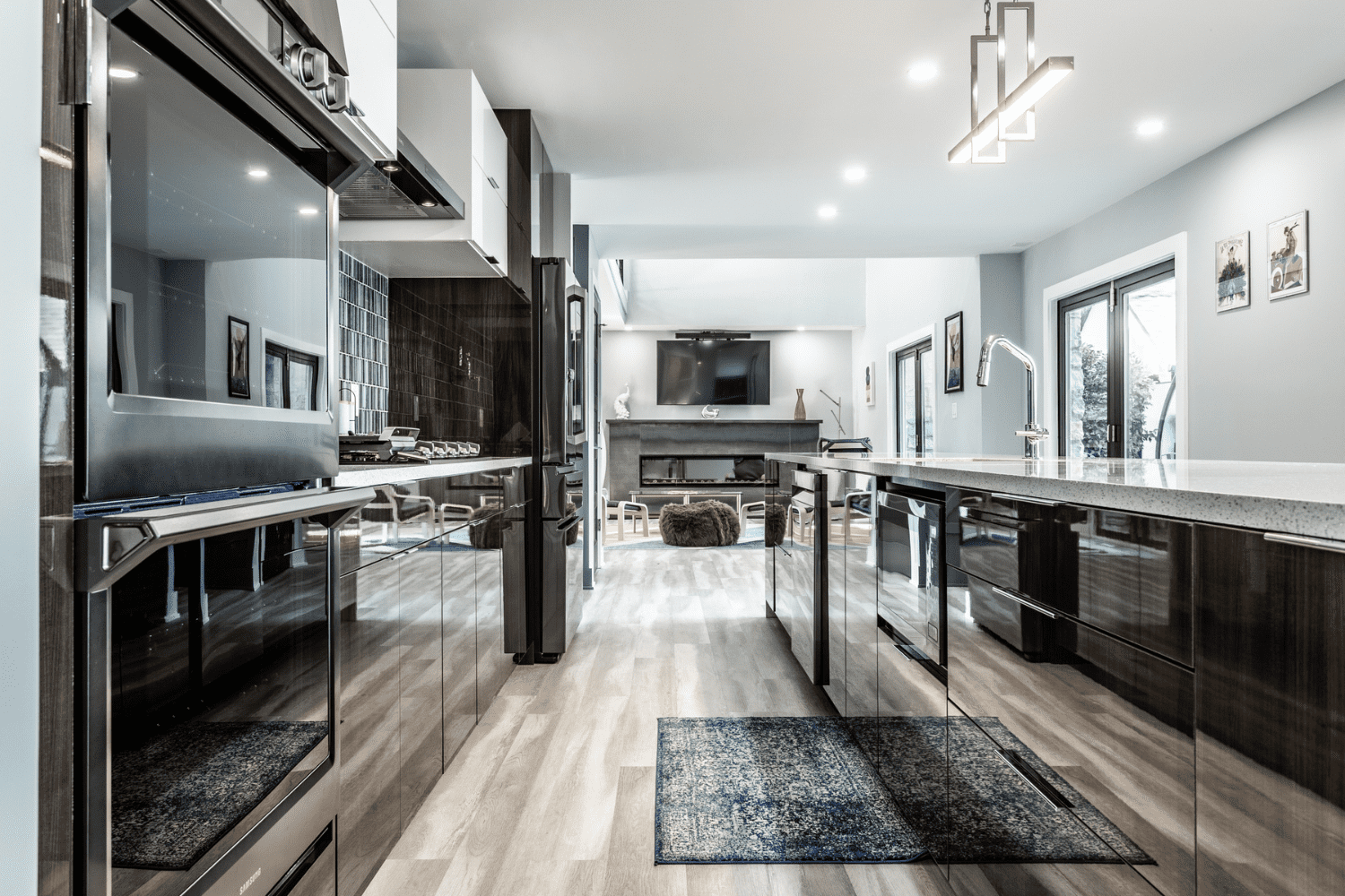
To create a cohesive tone, we did play with splashes of the same color here and there – a stained island, granite countertops, an Anthracite sink, and mosaic fireplace tiles.
Let there be light and space – and there was.
Our greatest contribution to this setting is creating space and drawing in illumination which our customers wished for but didn’t know how to do Maximizing every inch of an already small space like this kitchen was a challenge we gladly accepted. We eliminated all unnecessary fixtures and replaced them with features which enhanced lifestlyle, while making sure there was a space for everything, even the kitchen towels, minor details that are often overlooked was stimulating.
Recessed parts of the wall helped accommodate large appliances, effectively freeing up the area they first used to occupy. Removing the divider that separated the eat-in areas made way for an island in its place. We purposely installed the sink in the middle so that the rest of the countertop doubles up as a dining table which fits six chairs. But without the divider, the kitchen and dining zone seemed too close to the living room. To provide a delineation while maintaining the space we were able to create, we installed a white vertical beam that ran from floor to ceiling.
We turned the kitchen perspective around to take advantage of the natural sunshine entering through the glass doors. This light was enhanced by its reflection on the lighter colors of the paint we used. Removing the hanging lamps also created overhead space, augmenting the impression of a high ceiling. And using tiles for the backsplash added texture to an otherwise linear, and potentially boring, white wall.
Materials used in this cicero kitchen remodel
- Cabinets: Shiloh Cabinetry, Inset Square Flat Panel door style, 5-piece drawer fronts, Amerock Esquire collection cabinetry hardware
- Perimeter: Arctic painted finish
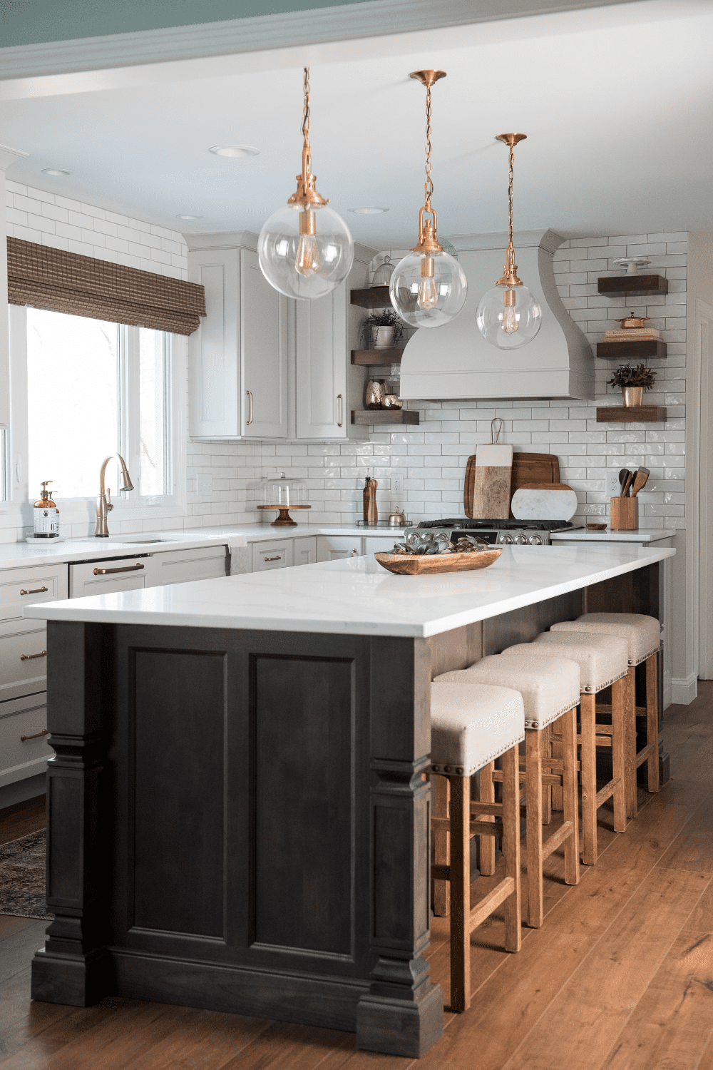
- Island: Poplar Carbon stained
- Kitchen Countertops: Oyster White granite
- Kitchen Sink: Blanco Diamond 60/40 split in Anthracite color
- Backsplash: Boutique 3×8 white hand-crafted tile
- Flooring: Evoke Hope LVP
- Fireplace: Evoke Emser Citadel Gray Linear Mosaic tile
REMODEL A SMALL BUT ESSENTIAL PART OF YOUR HOME AND TAKE YOUR DAILY LIVING FROM MUNDANE TO SENSATIONAL WITH EXCITING LITTLE DETAILS
For the final touch to complete the picture: We replaced all of the old trim and interior doors to 5-panel shaker doors in white paint and with a craftsman trim. Compared to the old wood stained cove trim and slab doors, the new look certainly upgraded the entire space. And while it accentuated just one part of the room, it blends well with the ceiling and other accents in white, such as the cabinets and the backsplash tiles.
The before and after pictures of the Cicero kitchen remodel show the sheer transformation of a homely but cramped cooking and dining area into a classy and roomy space that can comfortably seat the entire family with sufficient space for more.
We were able to take this from concept to creation successfully and to the absolute delight of the client by combining broad vision and careful thought with smart design.
THE FOLLOWING ARE OUR Kitchen REMODELING SERVICE AREAS
McCordsville, Indiana
Fishers, Indiana
Carmel, Indiana
Lawrence, Indiana
Greenfield, Indiana
Zionsville, Indiana
Noblesville, Indiana
Whitestown, Indiana
Westfield, Indiana
Rocky Ripple, Indy, Indiana Meridian Kessler, Indy, Indiana
Castleton, Indy, Indiana
Meridian Hills, Indy, Indiana
Fortville, Indiana
Pendleton, Indiana
